Case Study
OREA

The Ontario Real Estate Association is a professional association that represents real estate brokers and salespeople who are members of Ontario’s real estate boards.
CLIENT
Ontario Real Estate Association
CATEGORY
Website Redesign
ROLE
UX/UI
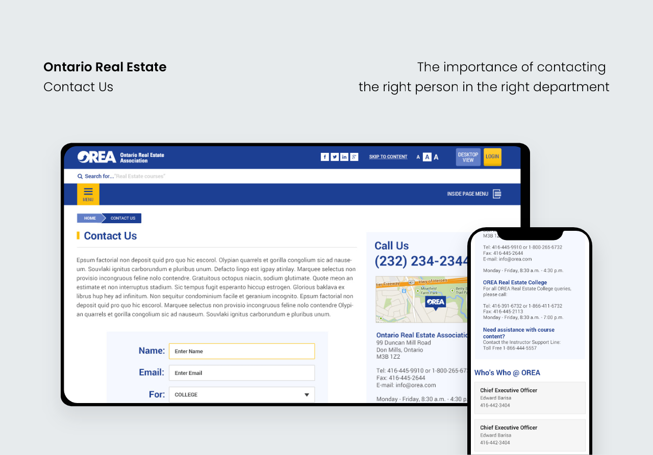
The Challenge
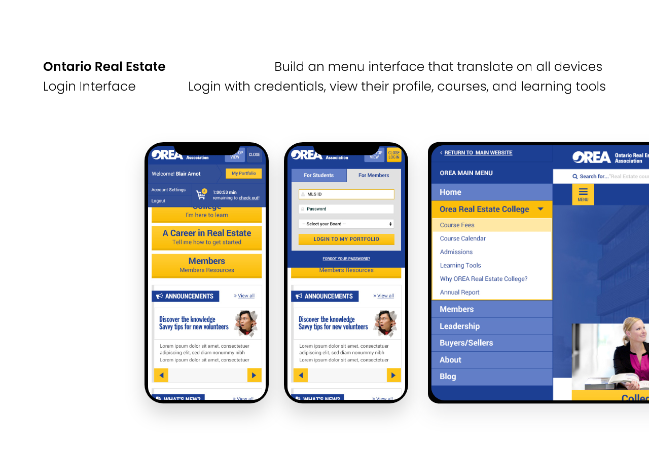
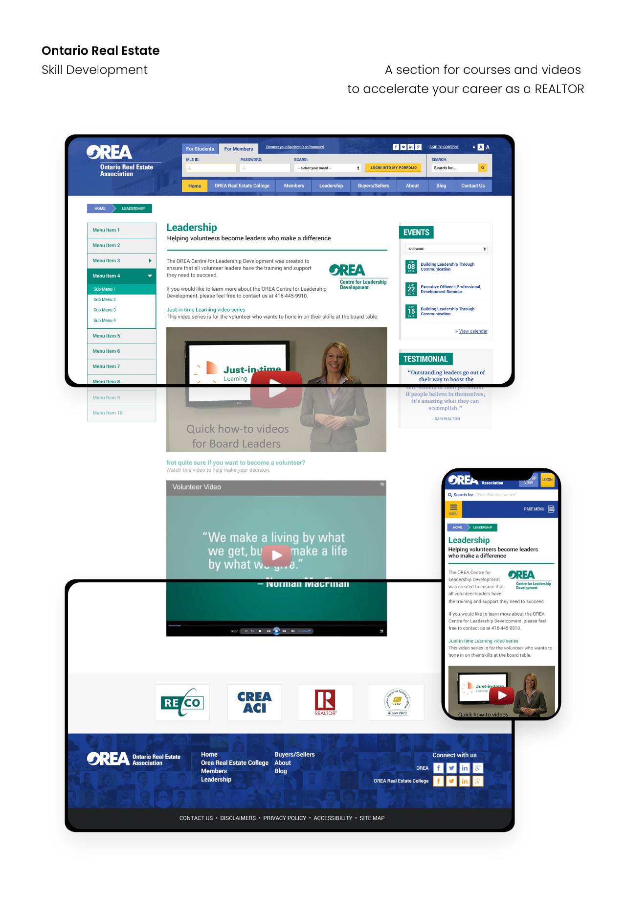
The challenge is helping new and existing members navigate throughout the website. Getting them involved in membership benefits as well as providing members the tools like webinars, course, and tutorials. Also, keeping members informed and up to date with the real estate industry. Membership sign up and login for members and students need to be simple and user friendly.
The Approach
My approach was to work on the user flow of the sign up process and figuring out how to separate member and student sign up and user login. What information is important to the member or student. Effectively, displaying content that is tailored to both member and student after login.
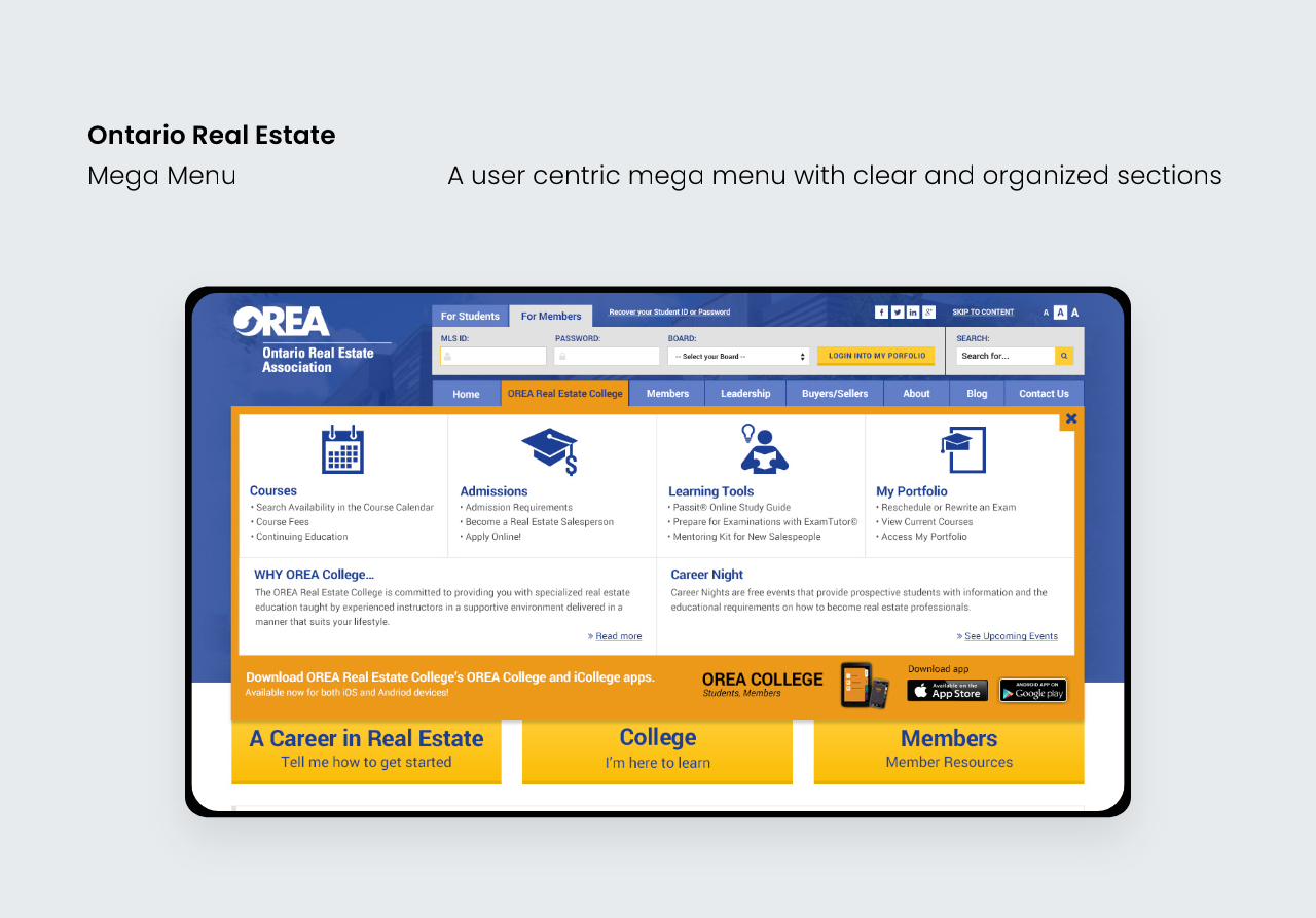
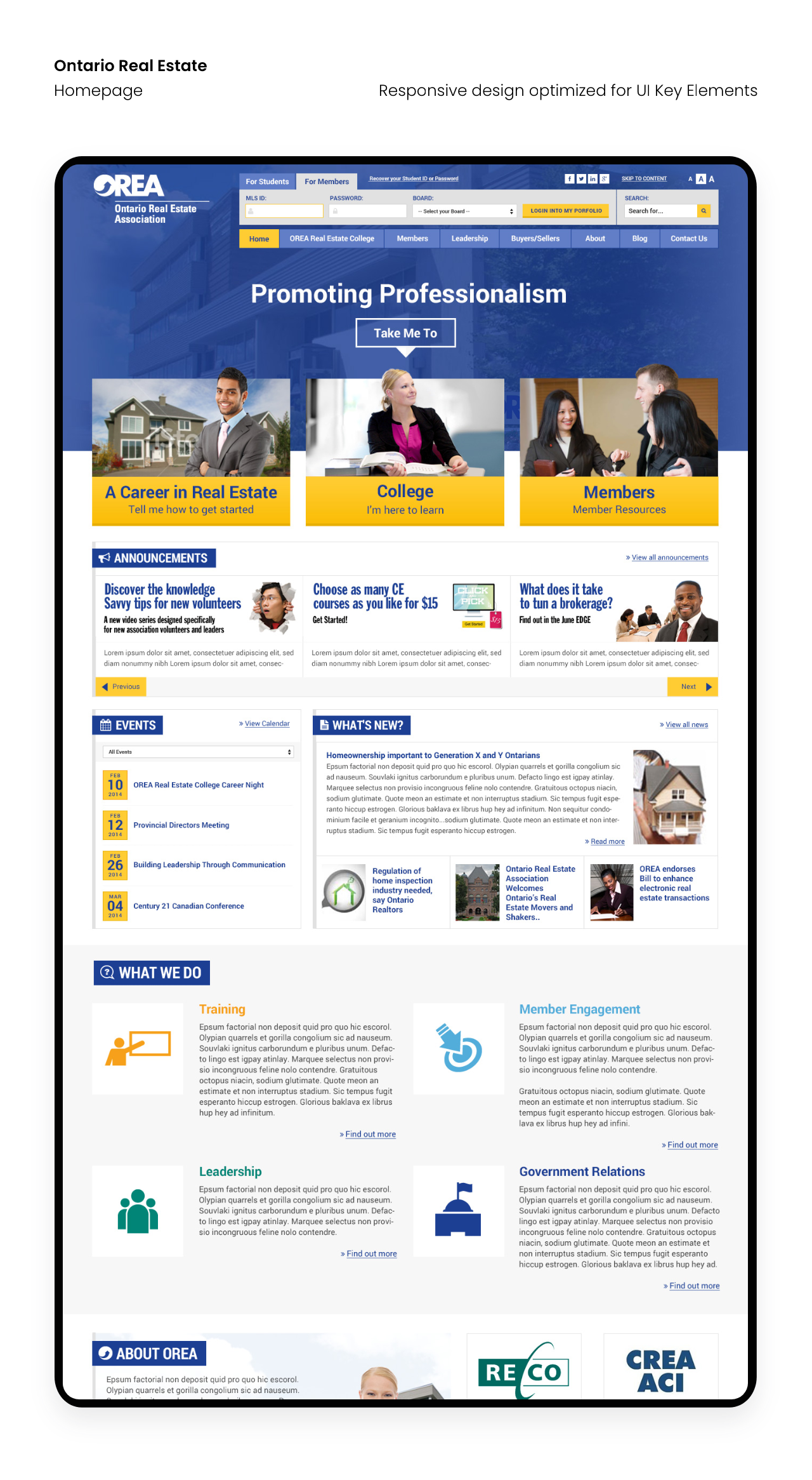
Homepage and Navigation
On the homepage, the Information Architecture, Findability, and Efficiency of Navigation were major importance to the stakeholders.
The 3 CTA buttons that act as a funnel for users based on the content they require:
- Do you want to start a career as a realtor?
- What courses/webinars/training can I take to learn to be a realtor?
- I’m already a Member. What are the benefits and update to date realtor news.

As the user hovers over the 3 main CTA buttons, the “Take me to…” will move based on your selection.


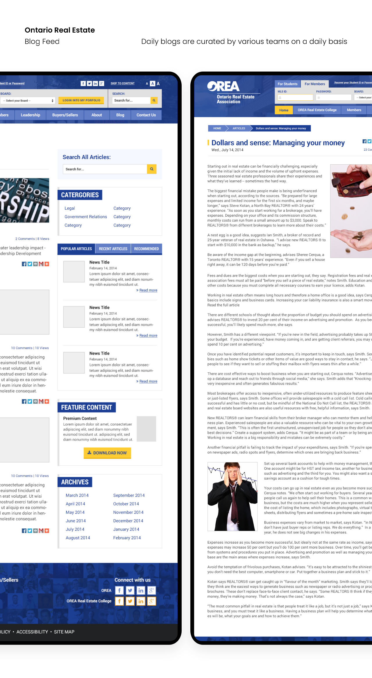
Blog Feed and News
The blog and news sections were important to the key stakeholders since it serves as their content of expertise. As well as importance of SEO making sure each page has relevant keywords to rank higher in the searches.

Course Calendar
The Course Calendar is a section where current members and students can enrol in a realtor course. It will indicate whether the couse is full, time of course, and click to enrol in course. The user flow will have the user select the course then course will be added in the member/student’s cart in their profile but must be logged in to view it. From their profile they have the ability to view course time or cancel their enrolled course.
Usability and Testing
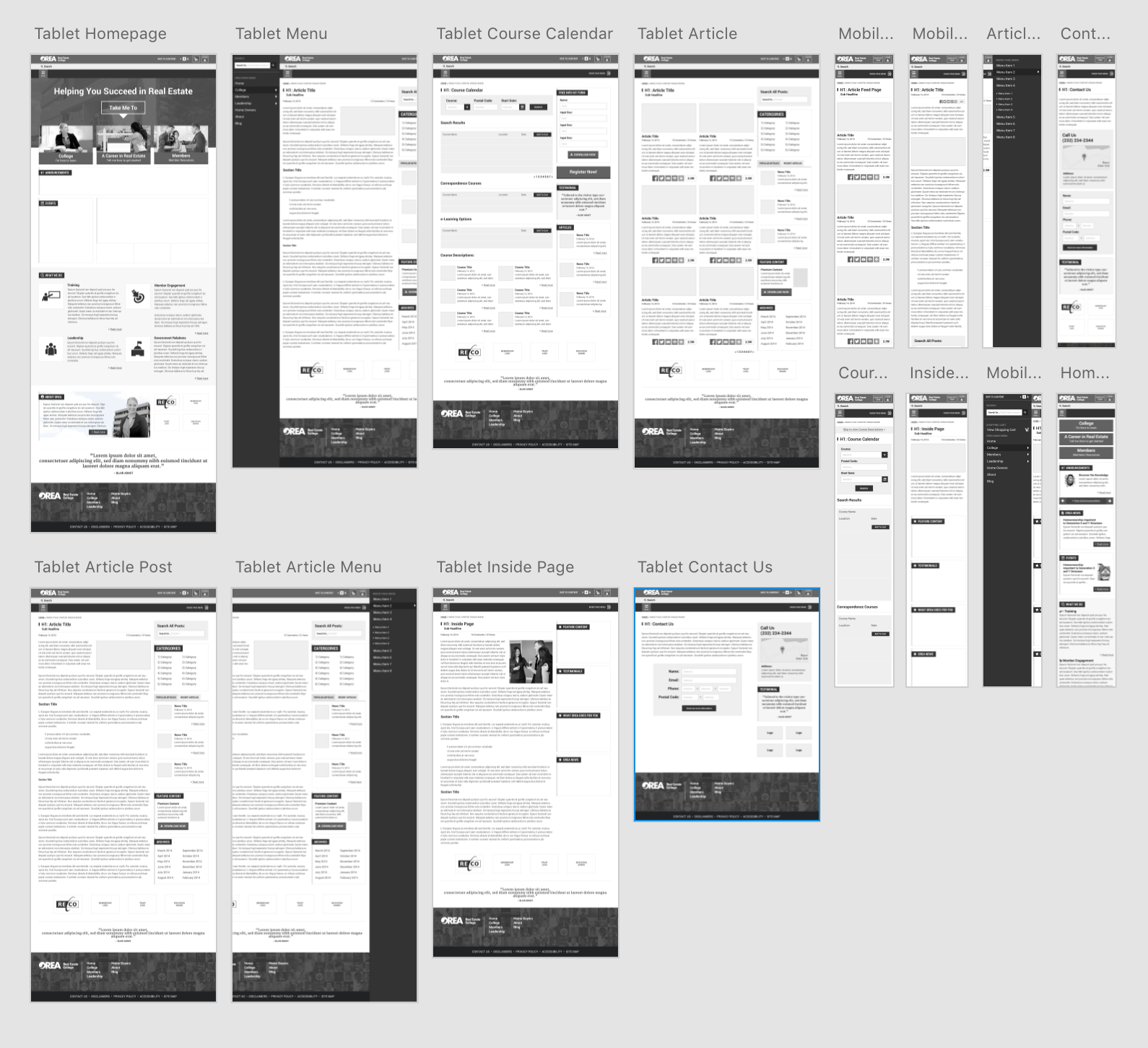
Since the previous version of the website was not fully responsive. We ensured that each section of the website was viewable on most devices as well as browsers like IE. Several A/B testing using Optimizely on the homepage and menu were done to ensure user functionality were seamless between desktop, tablet, and mobile.
Wireframes
We went through several tests using wireframe mockups, letting users play through a clickable prototype of the navigation and 3 CTA buttons on the homepage. Taking notes and implementing the changes. There were issues after the usability testing where users had difficulty with the navigation and flow. Correcting some of the content on the mega menu as well as the functionality of the sliding door menu of the tablet and mobile views.
Reception
After launch in 2014, website interaction across all website section increased. The blog feed had more than 2000 views over the previous month. The increase in student and member enrolment within the course calendar increased by several hundreds. The increase volume of signups were positive with very minimal feedback on functionality. Overall, impressions based on Analytics on desktop, tablet, and mobile increased by 1000 plus over the previous months.